
TAB2GRAPH
A conversion of Tabular Data to Graph Data, Part-1.


Graph Convolutional Networks require Input data to be in a graph-structured format. Today's biggest challenge among AI industry researchers, data scientists and ML engineers is:
How to convert Tabular data into a graph formatted data.?
How to implement graph algorithms, such as GCN's and others to unleash the powerful and complex representations from graph data ?
Recap from the previous GCN articles:
🔸 For details on the graph data and Graph Neural Network, Read here.
🔸 For details on Graph ML Practical Applications, Read here.
This Article series will explain in detail the graph data conversion. Welcome, one and all, to the magical world of TAB2GRAPH! Part 1 Article Series Using Python.
Core Contents of the Article
Let's discuss the tech content of this article; we will be discussing in detail about:
What is Tabular Data,
What is Graph Data,
Why do we need to convert Tabular data to graph formatted data, and what is its importance?
How to convert, its guidelines and explanation
And finally, a real-time example of conversion with a dataset using Python.
Let’s jump a bit into the brief overview of the Tabular and graph data
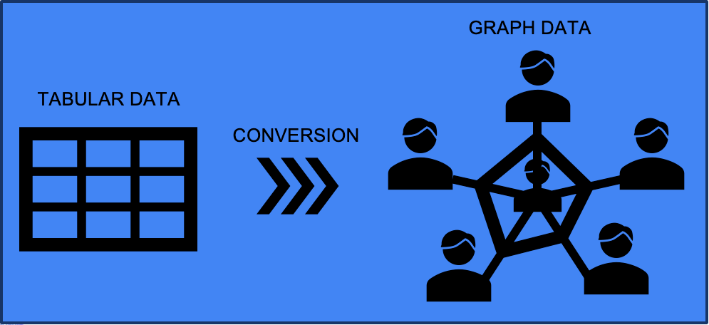
Tabular Data
Tabular data is structured data organised in rows and columns, similar to a table. It is a standard format for representing structured information in various fields, including databases, spreadsheets, and CSV (Comma-Separated Values) files.
Fig. 1 below is an example of a tabular data structure.

Tabular data is typically used to represent structured datasets where each row represents a record or an observation, and each column represents a specific attribute or variable.
In tabular data, the first row often contains column headers, which provide labels or names for each column, while subsequent rows have data values for each attribute.
Each cell in the table represents a specific data value at the intersection of a row and a column.
Graph Data
Graph data refers to data that is organised and represented using a graph structure. A graph is a collection of nodes (also known as vertices) connected by edges. Graph data can describe relationships, connections, or interactions between entities.
In a graph, nodes represent individual entities such as people, objects, or concepts, while edges represent the relationships or connections between those entities. Graph data allows for representing complex and interconnected relationships not easily captured by traditional tabular data structures.

Graph data can be used to model and analyse various types of networks, including social networks, biological networks, transportation networks, computer networks, and more. It provides a powerful way to understand and analyse the relationships and dependencies within a system.
Need of Conversion - Tabular to Graph Data?
The conversion of tabular data to graph data leverages the power of graph representations, algorithms, and visualisations to gain deeper insights into the relationships.
Which offers a more comprehensive and intuitive way to analyse the relationships and connectivity within the data. It opens up possibilities for advanced relationship analysis, network exploration, and gaining deeper insights into the underlying structure of the data.
Graph Algorithms
Graph algorithms are specifically designed to analyse and extract insights from graph data. By converting tabular data to graph data, you can apply various graph algorithms to uncover valuable information.
These algorithms can help identify central nodes, calculate network metrics, perform clustering, and other algorithms like (Graph Search Algorithm, Path Finder Algorithm—to find shortest paths, Centrality Algorithm, Community Detection Algorithm—to detect communities, Graph Embeddings, Link Prediction, Connected Feature Extraction)
Leveraging graph algorithms allows you to gain deeper insights into the relationships and connectivity patterns within the data.
Visualisations
Graph data can be visually represented using network diagrams or graph visualisations. By converting tabular data to a graph and visualising it, you can explore and understand the relationships and connectivity more intuitively.
The below video is an example of a visualisation of population graph data based on several counties in Ireland.
Graph visualisations enable the identification of clusters, patterns, bottlenecks, or outliers, making communicating and interpreting the data easier.
Visual representations of graph data enhance the ability to gain deeper insights and make informed decisions.
Relationship Analysis
Graph data enables advanced relationship analysis. Converting tabular data to graph data allows you to explore the connections and interactions between entities more effectively.
🔸 For example, you can identify influential nodes and understand the flow of information or resources.
Graph Representations
Graph data provides a more natural and intuitive representation of complex relationships than tabular data. By converting tabular data to a graph, you can more effectively capture the connections and dependencies between entities.

Graphs allow you to represent relationships such as friendships, collaborations, dependencies, or hierarchical structures.
The detailed information and types of graph representation implementation using Python are explained below.
Conversion of Tab2Graph Using Python
Below is the overview of the conversion guidelines using Python
First, we need to understand the CSV data and its structure.
Once we clearly understand the data, we can initialise an empty graph. The choice of graph representation, such as adjacency list, adjacency matrix, or edge list, depends on the specific use case and the operations we want to perform on the graph.
Next, we iterate over the CSV rows. For each row, we create nodes in the graph to represent the entities or objects described in the data. The nodes can be created based on specific columns in the CSV, such as unique identifiers or labels.
After creating the nodes, we develop edges representing the entities' relationships or connections. The edges can be made based on relationships defined in the CSV, such as shared attributes or references between entities.
A graph representation refers to how a graph data structure is stored or represented in a computer program or system.
A graph can be represented using different data structures, each with advantages and trade-offs. The choice of graph representation depends on the specific use case and the operations that must be performed on the graph.
Let’s discuss the types of graph representations, such as
Adjacency List
Adjacency Matrix
Edge List.

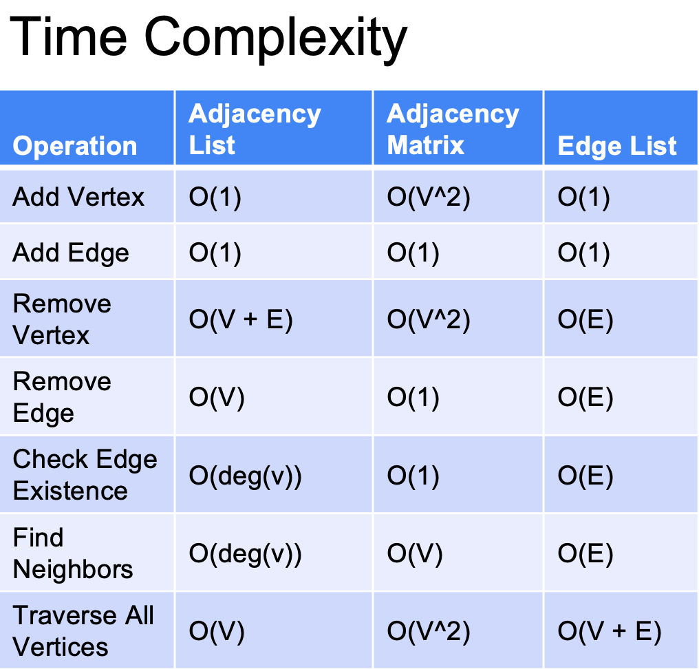
🔸 Adjacency List
The adjacency list representation is efficient for sparse graphs as it only stores the neighbouring nodes for each node.
Resulting in a space complexity of O(V + E). where v is vertices and e is edges
Constant time -O( 1 ) for Adding Vertices and Edges
It uses a dictionary or an array of linked lists to implement the graph.
🔸 Adjacency Matrix
The adjacency matrix representation uses a matrix of size V x V to indicate edge presence or absence,
Resulting in a space complexity of O(V^2).
Time complexity for adding vertices is O(V^2) and constant time - O( 1) for adding edge.
It is efficient for dense graphs where the number of edges is close to the number of nodes but can be memory-intensive for large graphs.
🔸 Edge List
The edge list representation is suitable for graphs with any sparsity and represents the graph as a list of edges.
Resulting in a space complexity of O(E).
And time complexity for adding vertices and edges is constant time - O( 1 ).
It provides flexibility and simplicity in representing the graph structure.
Overall, the choice of representation depends on the graph's sparsity, the operations to be performed, and the available memory resources.,
Below is detailed information regarding the Time complexity with every operation performed in the graph.
Code Implementation
HEY READERS !!!,
For the past few minutes, we have understood the basic concepts of conversion strategies; now, let’s jump to the critical part of the article. Here we will take example data and perform Tab2Graph using Python code.
Social Network Graph Data
We have taken the example social network tabular data dataset and will follow the conversion guidelines we discussed previously.
The CSV file has three columns such as : "source," "target," and "relationship." Each row represents a relationship between two individuals.

The "source" column denotes the person initiating the relationship,
The "target" column indicates the person receiving the relationship. and
The "relationship" column describes the type of relationship.
Looking at the nodes and edges from the CSV,
we have manually visualised them.
Our end goal is to bring the same feature using Python.

🔸 Complete Code
import pandas as pd# Initialise an empty graphgraph = {}# Iterate over the CSV rows We'll iterate over each row in the DataFrame and process the data.# Create nodes for each row, we'll check if the source and target nodes already exist in the graph. If not, we'll create them.# Create edges, we'll add the edges to the graph by appending the target node to the list of neighbours for the source node.# Perform additional data transformations (optional) In this example, we don't have any additional transformations. But you can modify the code to include any necessary data transformations, such as assigning attributes or weights to nodes or edges. # Finally, Analyse or visualise the graph (optional) Once you have the graph, you can perform various analyses or visualise it using graph analysis libraries like NetworkX or visualise it using tools like Gephi.for index, row in df.iterrows():
source = row['Source']
target = row['Target']
relationship = row['relationship']
if source not in graph:
graph[source] = []
if target not in graph:
graph[target] = []
graph[source].append(target)
print(graph)
🔸 The result of the Graph data looks like this
{'Alice': ['Bob', 'Charlie'],
 'Bob': ['Charlie'],
 'Charlie': [],
 'Dave': ['Eve'],
 'Eve': []}
Where,
Alice is Directly Connected with Bob and Charlie
Bob is Connected with Charlie
Charlie has no Further Direct Connections
Dave is directly connected with Eve
Eve has no Further connections
🔸 Visualisations
For visualisation, we use the network library in Python. The visualisation shows us the number of nodes and edges and how they are connected well in detail. By finding two major measures, they are degree centrality and betweenness centrality.
Degree centrality
Measures a node's importance based on its number of edges.
It is defined as the number of edges connected to a node divided by the maximum possible edges in a graph.
Betweenness centrality
Measures the extent to which a node lies on the shortest paths between pairs of other nodes.
It quantifies that a node influences the information flows through the graph.
🔸 Visualisations Code
import networkx as nx
import matplotlib.pyplot as plt
graph_dict = graph
# Create a NetworkX graph from the dictionarygraph = nx.Graph(graph_dict)# Analyze the graphprint("Number of nodes:", graph.number_of_nodes())
print("Number of edges:", graph.number_of_edges())# Calculate degree centralitydegree_centrality = nx.degree_centrality(graph)
print("Degree centrality:", degree_centrality)# Calculate betweenness centralitybetweenness_centrality = nx.betweenness_centrality(graph)
print("Betweenness centrality:", betweenness_centrality)# Visualise the graphpos = nx.spring_layout(graph)
plt.figure(figsize=(20, 8)) # Set the figure size
nx.draw_networkx(graph, pos=pos, with_labels=True, node_color='lightblue', edge_color='gray')# Increase spacing between labelslabel_spacing = 0.05
pos_labels = {node: (x, y + label_spacing) for node, (x, y) in pos.items()}
nx.draw_networkx_labels(graph, pos=pos_labels, labels=degree_centrality, font_color='red', font_size=10, font_weight='bold', verticalalignment='bottom', alpha=0.7)
pos_labels = {node: (x, y - label_spacing) for node, (x, y) in pos.items()}
nx.draw_networkx_labels(graph, pos=pos_labels, labels=betweenness_centrality, font_color='blue', font_size=10, font_weight='bold', verticalalignment='top', alpha=0.7)plt.show()🔸 Visual Results
Number of nodes: 5
Number of edges: 4
Degree centrality: {'Alice': 0.5, 'Bob': 0.5, 'Charlie': 0.5, 'Dave': 0.25, 'Eve': 0.25}
Betweenness centrality: {'Alice': 0.0, 'Bob': 0.0, 'Charlie': 0.0, 'Dave': 0.0, 'Eve': 0.0}
🔸 Graphical
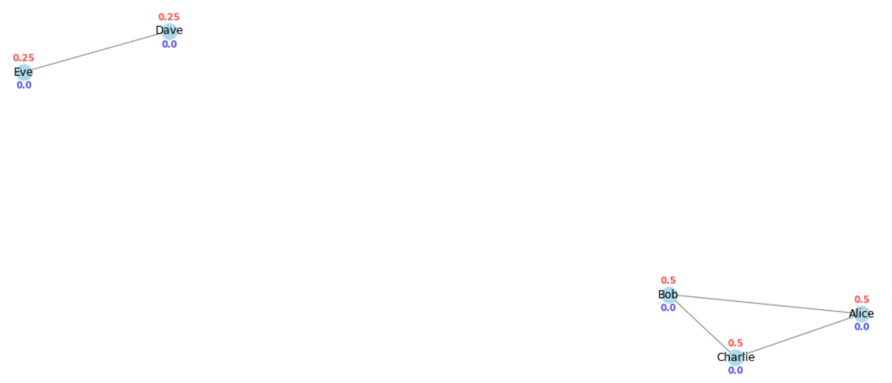
FINALLY !!!, our manually created Graph (Fig.7) Visualisation matches the Networkx Created Graph Visualisations using Python.

Stay Tuned!
Tab2Graph Part-2 Using Neo 4j……..COMING SOON……..!!!!!